INPUT
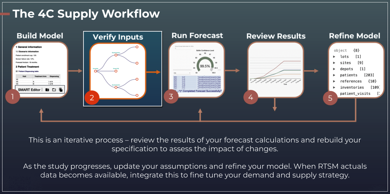
The input screens in 4C Supply® exist to allow users to verify that the information they input to their specification has been interpreted as intended. Reviewing the information in the input screens is a critical step in forecasting and should always be completed prior to initiating a forecast.

Once the interpretation of a specification is completed in the SMART Editor, the input screens will display the information from the relevant section of the specification. If there is no information relevant to a specific screen, then it will remain blank.
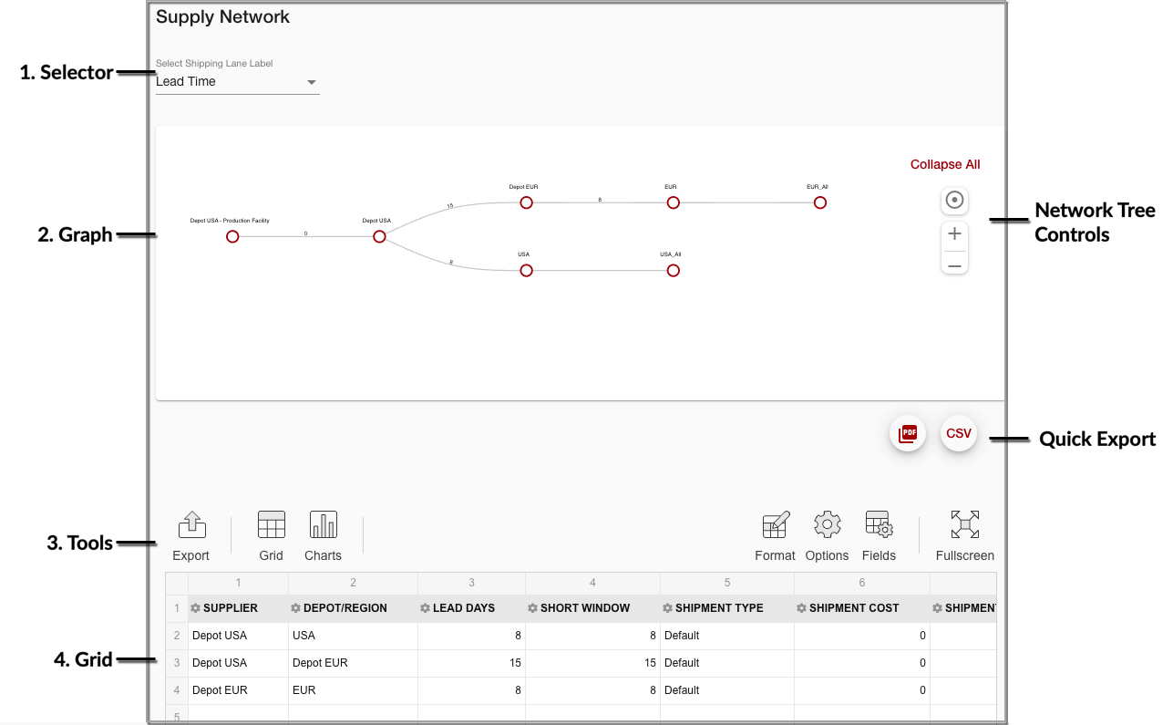
Any relevant information is displayed in grids and graphs that function in the same way as other grids in 4C Supply®, allowing users to sort, format, and export the information as required. Two input screens also feature tree diagrams, Patient Treatment and Supply Network (pictured below).

Input Screen Elements
1. Selector
Selectors (or Network Level selectors) are shown in some screens to the top left. The selector determines which data level is displayed. Only one level can be viewed at a time and the display is refreshed when a different level is selected.
Note: In scenarios with cohorts, regional dispensing, or study phases, there are multiple patient treatment trees; one for each cohort, region, and study phase. Each patient treatment tree can be accessed using the a secondary ‘treatment plan’ selector.
2. Graph
Some input screens feature graphs shown above the grid as pre-formatted visual representations of the input data.
3. Tools
The tools listed below are available in each input screen:
Export: Configured screen data sets can be exported to different formats via the export button. There are also options for quick export to PDF and CSV to the top right of the graph.
Grid: Formats the data from a chart into a grid (see next bullet).
Charts: Formats the data from a grid (default) into a chart. This chart is an optional secondary view that replaces the grid.
Fullscreen: Enables fullscreen view of the screen.
Format: Allows for the application of formatting rules, including conditional formatting.
Options: Provides access to toggle between the following display options:
Different ways to show grand totals
Different ways to show subtotals
Different grid forms:
Classic: fields shown as filters, columns, rows, and values
Compact: fields shown as filters, columns, rows, and values
Flat: fields shown as columns and values
Fields: Fields are the parameters shown on the screen. Fields can be selected and deselected for display in the popup menu which appears when the Fields icon is clicked. In the same popup menu, fields can be selected for display as filters, columns, rows, or values.
4. Grid
Grids are shown in every input report and function as pivot grids, providing many options to shape the screen data:
Filters: Data from fields selected for display as filters are not shown on the screen. Instead, values can be selected and deselected to filter the data shown in the screens. Fields selected for display as filters can be dragged and dropped into the grid for display as columns or rows.
Columns: Values from fields selected for display as columns are shown as screen columns. If multiple fields are selected for display as columns, then their collapse/expand behavior follows the selected hierarchy (left = high). The column hierarchy can be changed by dragging and dropping fields to different positions in the list of columns. Fields selected for display as columns can be dragged and dropped for display as filters or rows.
Rows: Values from fields selected for display as rows are shown as screen rows. On many screens, periods of time are shown as rows by default. If multiple fields are selected for display as rows, then their collapse/expand behavior follows the selected hierarchy (top = high). The row hierarchy can be changed by dragging and dropping fields to different positions in the list of rows. Fields selected for display as rows can be dragged and dropped for display as filters or columns.